


We admit it. The thought of painting a room in greige—a combination of gray and beige—hardly sounds like creating a must-see kind of space. But that’s the magic of greige. It’s not so much about how ‘it’ looks on the wall as it is about how it makes everything else in the room look.
The best of both worlds
On their own, gray and beige are classic neutrals.
Beige has an uncomplicated, easygoing appeal that, thanks to its yellow undertone, leans toward warm. Gray, on the other hand, has a crisp, sophisticated vibe that, depending upon its undertone, can come off a little cool.
So, what happens when you marry these two hues? You get a versatile color that makes the most of each color’s best attributes while minimizing their potential drawbacks.
Here’s why:
- Adding gray to beige helps subdue any yellow undertone that can make it hard to coordinate with cooler colors.
- Adding beige to gray lends a richness to the color and creates a warm neutral.
How much you turn the dial on either color (gray to cool, beige to warm) depends upon the color ratio used.
For example, gray-heavy greiges like Muslin (DE6227), Reclaimed Wood (DET625), and Metal Fringe (DET626) are cool neutrals. A bit more beige-forward, Whisper Gray (DEC785), Pigeon Gray (DE6214) and Barnwood Gray (DET620) highlight the best in warm greiges.
Universal appeal and versatility
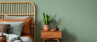
Equally at home in a mid-century bungalow nursery as in a modern farmhouse kitchen, greige is a bit chameleon-like in nature.
Surrounded by bright pops of color in furnishings or art, greige can almost disappear, allowing the other elements to take center stage. Or, when paired with other neutrals, it can accentuate the subtlety of each shade while standing firmly on its own.
Because it can complement a broad range of colors, greige can hold up to any changes in furnishings, art, or the changing style whims of growing children—or even your own desire to mix things up—without having to repaint.
Porous Stone (DE6220)
Pewter Patter (DET627)
Bison Beige (DEC750)
When choosing a greige paint color, consider all the other colors and elements that will share the space and determine where you want the focus to be.
Testing, testing …
While it’s really hard to go wrong with greige, it’s always best to take any color for a test run. One way to judge your color—or two or three— is with SIMPLESAMPLE™ Peel & Stick Sheets. Place then and view them for at least a few days in morning, afternoon and late-day light
If you prefer the real thing, go with a Dunn-Edwards DURATM Color Sampler. Each 6-oz. jar of paint covers up to 3 square feet.
The important thing is to live with the color and pay attention to how it works with other elements in the room. Notice which colors, features and furnishings shine. If it’s not quite hitting the note you want, try a warmer or cooler shade. Even the subtlest of shifts in greige can pull out hues and tones in other elements and transform a space.
For more examples of greige at play in different homes and settings, visit the Dunn-Edwards DURA Instagram and Pinterest pages.
To take a deeper dive, you can meet online with one of our Color Influencers to get expert advice on your toughest color dilemmas and learn more about our products and sampling options, or get started with our paint color quizzes.
Leave a comment