

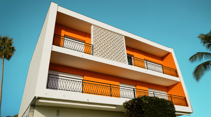
Specs+Spaces®
Color
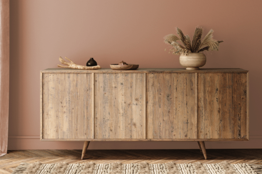
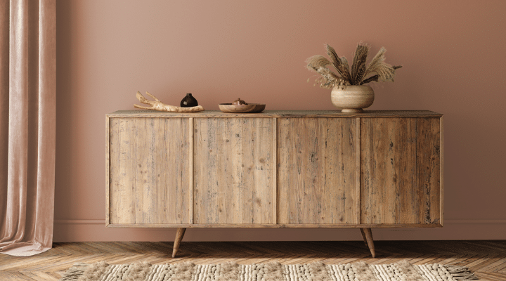
Colors of the Decade 1965
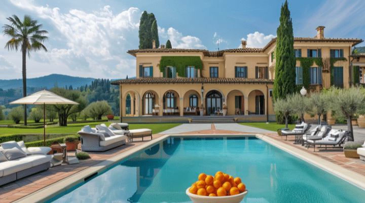
Specs+Spaces®
Color
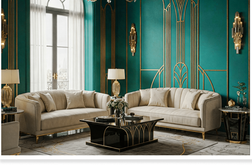
Colors of the Decade 2025
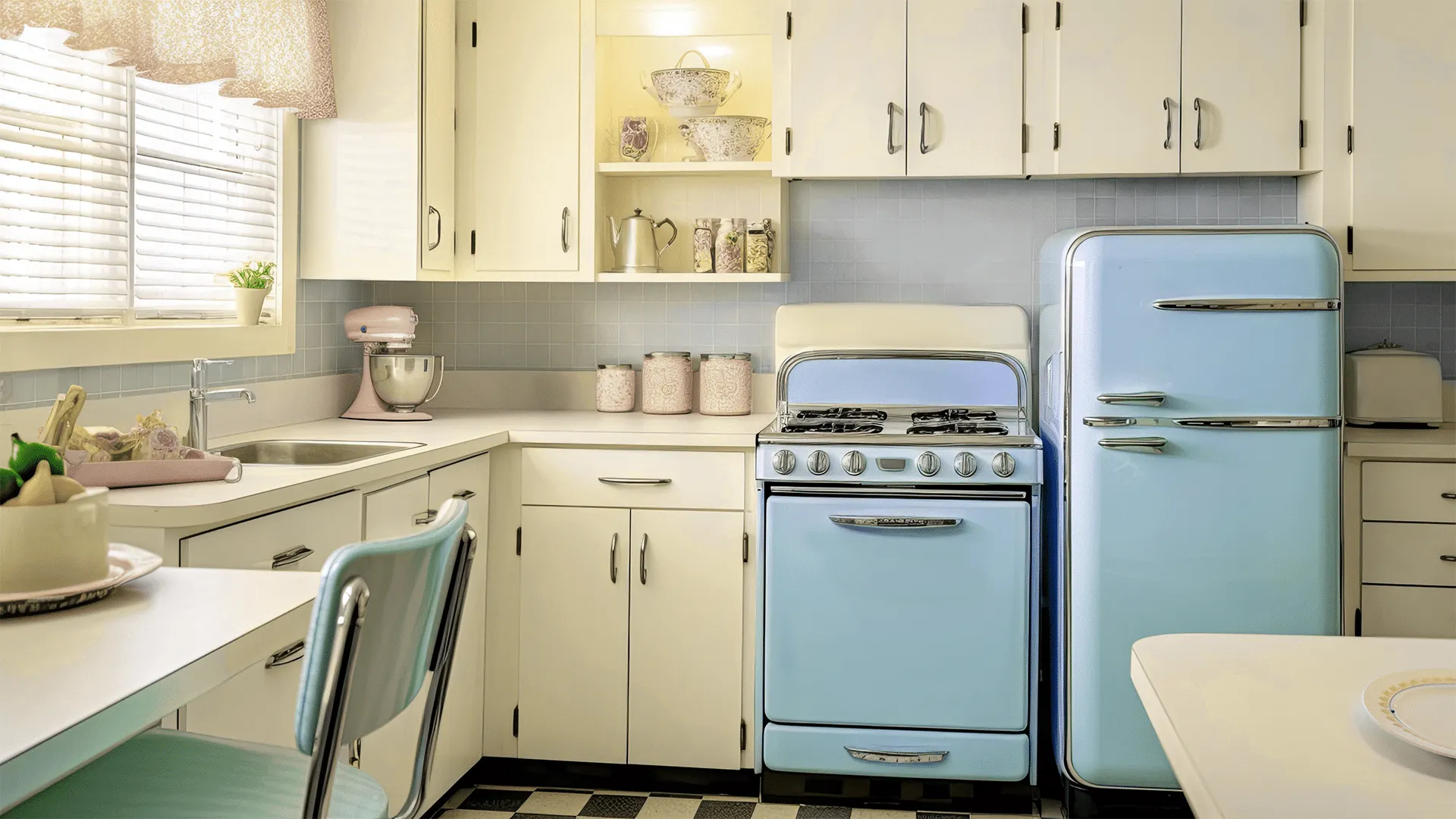
Specs+Spaces®
Color
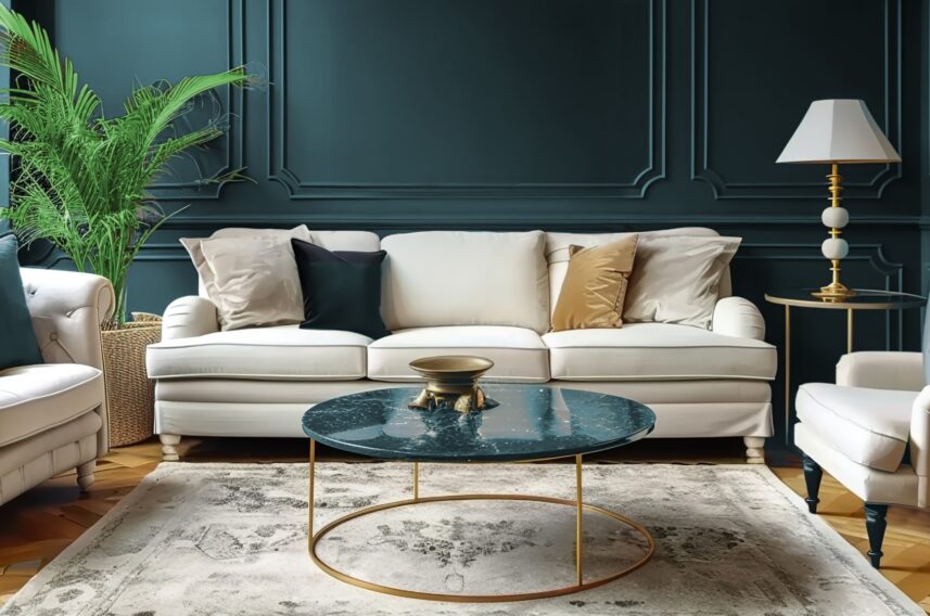
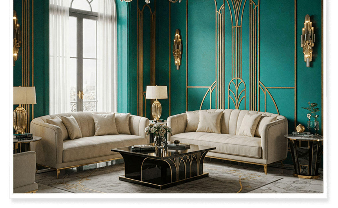
Colors of the Decade 1925
Specs+Spaces®
Color
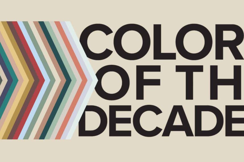
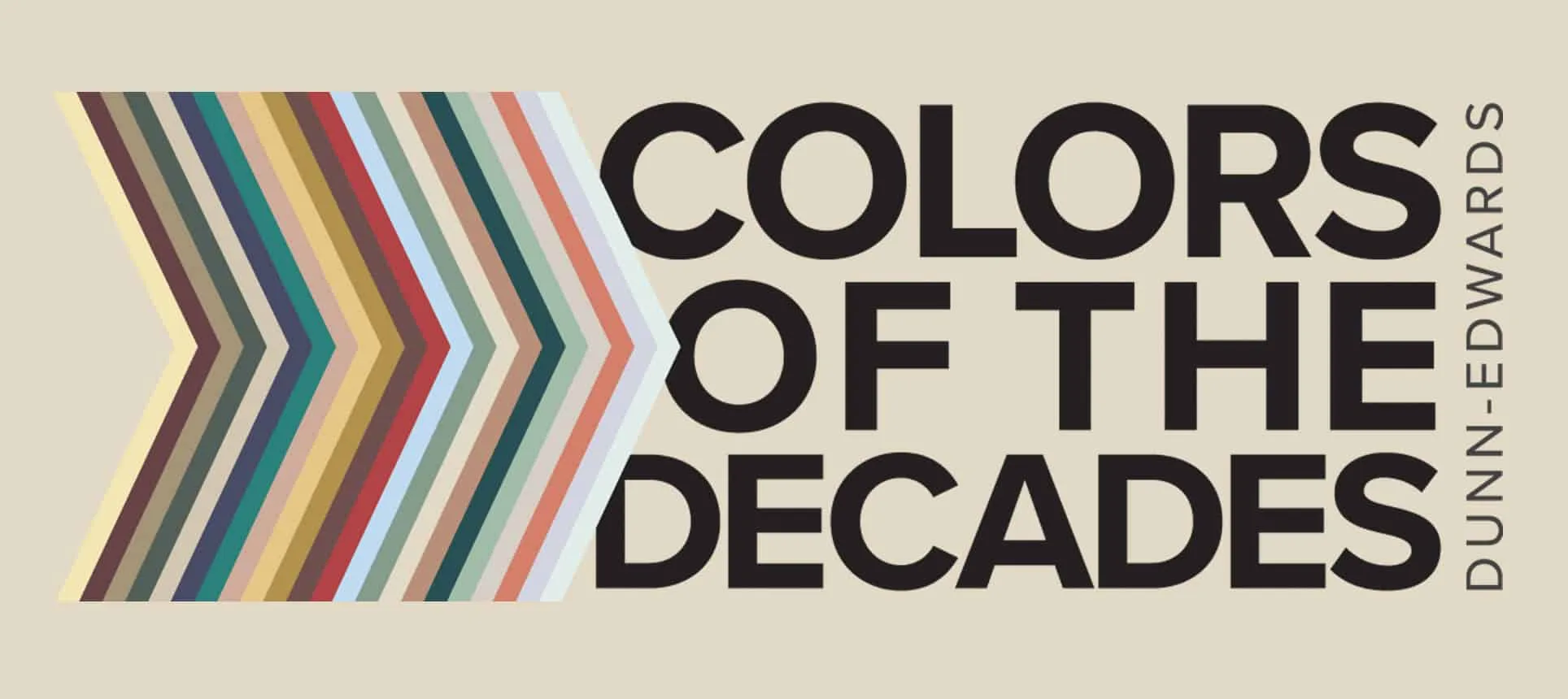
Announcing the Colors of the Decades
Specs+Spaces®
Color
Announcing the Color of the Century - Viridian Odyssey (DE1925)
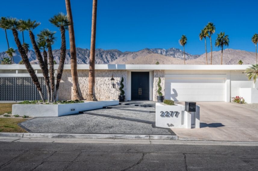
Specs+Spaces®
Color
Celebrating Mid-Century Modern Design at Modernism Week 2025
Specs+Spaces®
New at Dunn-Edwards
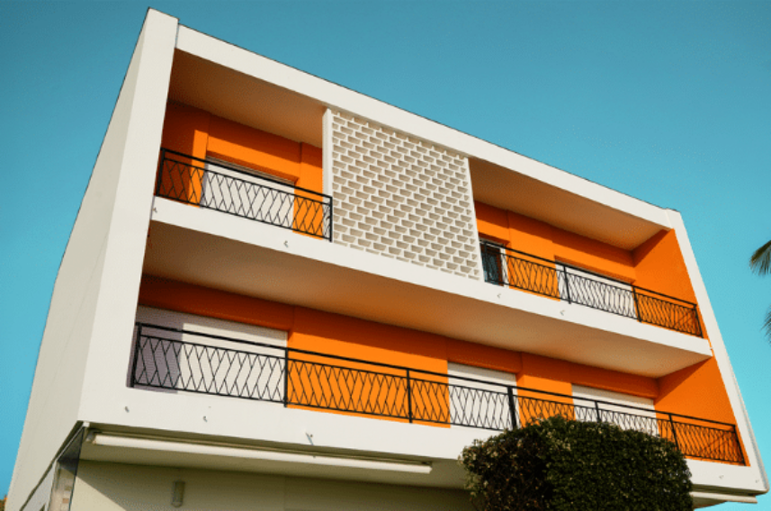
Introducing the Multifamily Color Collection

Specs+Spaces®
Showing 1 - 7 of 781 results

Featured Bloggers

Lauren Hoferkamp
Trends and Color Marketing Manager

Christina Bantigue
Marketing Communications Manager

Madison Pfeifle
Marketing Communications Specialist

Danielle Kinahan
Marketing Segments Manager